Cruxnow.com
A news and lifestyle website aimed at Catholics worldwide
1 | 13

Client
Boston Globe Media Company, circa July-October 2015
My Role
- Design Lead
- Prototypes
- Information Architecture
- Visual Design
- Typography
- Branding
- Logo Design
- Developer
- HTML
- CSS
- JavaScript
How might we …
- Establish a destination site about the Catholic Church aimed at members worldwide
- Create a secular site about religion, not a specifically religious site.
- Find a design and content voice that was newsy and modern but fit a traditional organization
- Reach a large audience with advertising targeted to their interests
Unique Challenges
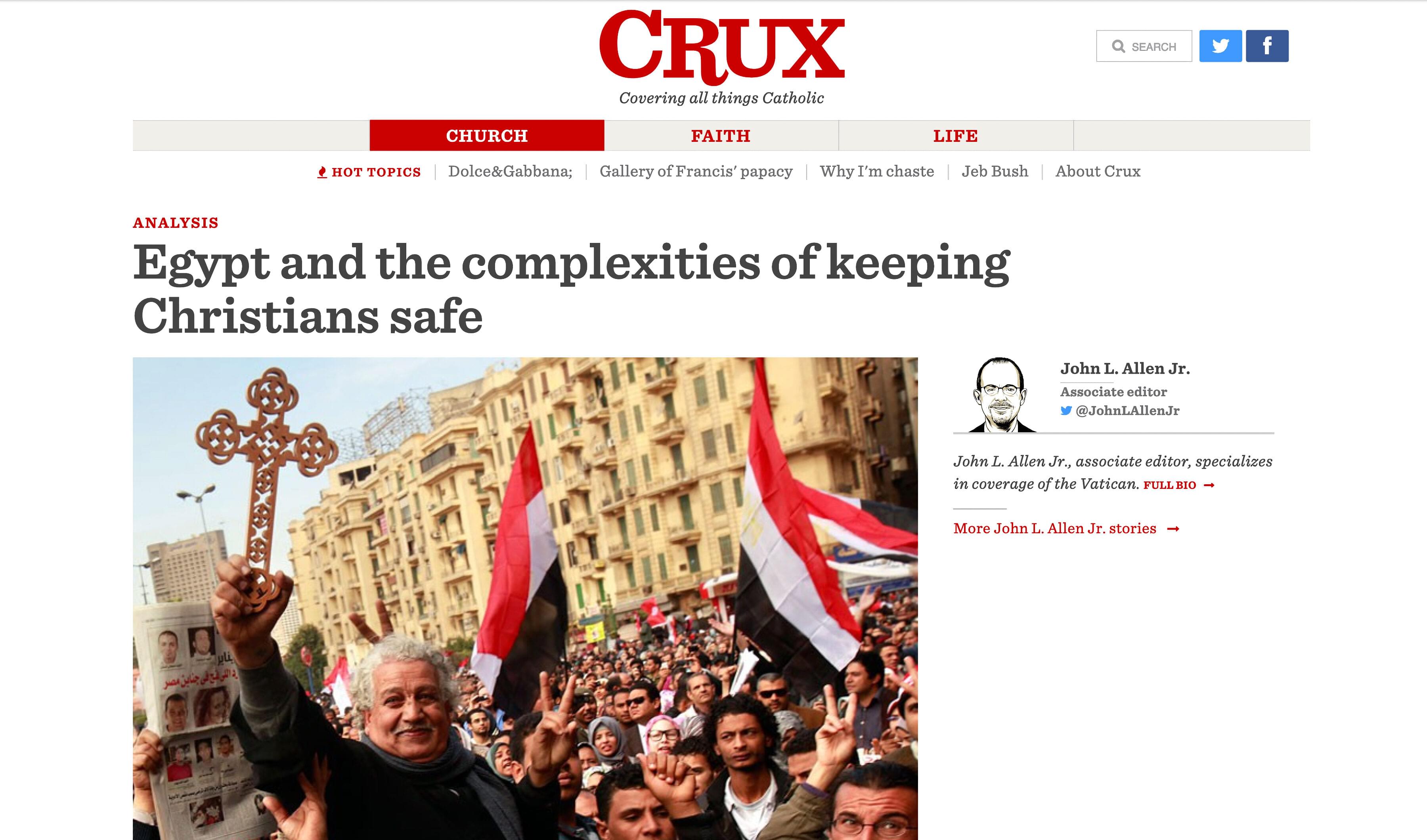
No. 1 | Crux needed brand and visual identity – including a wordmark
When Crux was formulated, it basically had a name and an editor. The face – branding, colors, typography – the overall visual design of the site – was TBD. What was known was that it was to be a news site, not a religious site – “no stained glass, no crosses.”
To set a design direction, I did:
- A series of mood boards to determine which direction was desirable
- A typography test of serif and sans-serifs that determined that Sentinel by Hoefler & Co. most accurately struck a balance of newsiness, modernity and tradition.
- A color test, during which we determined that red and white – colors both associated with news and with the Vatican – were strongest.
- A logo proved difficult. I benchmarked legacy news logos and wanted to design something reminiscent of the Time magazine logo – sturdy, confident, serious and timeless. The slight dip on the “R” was meant to evoke calligraphy.
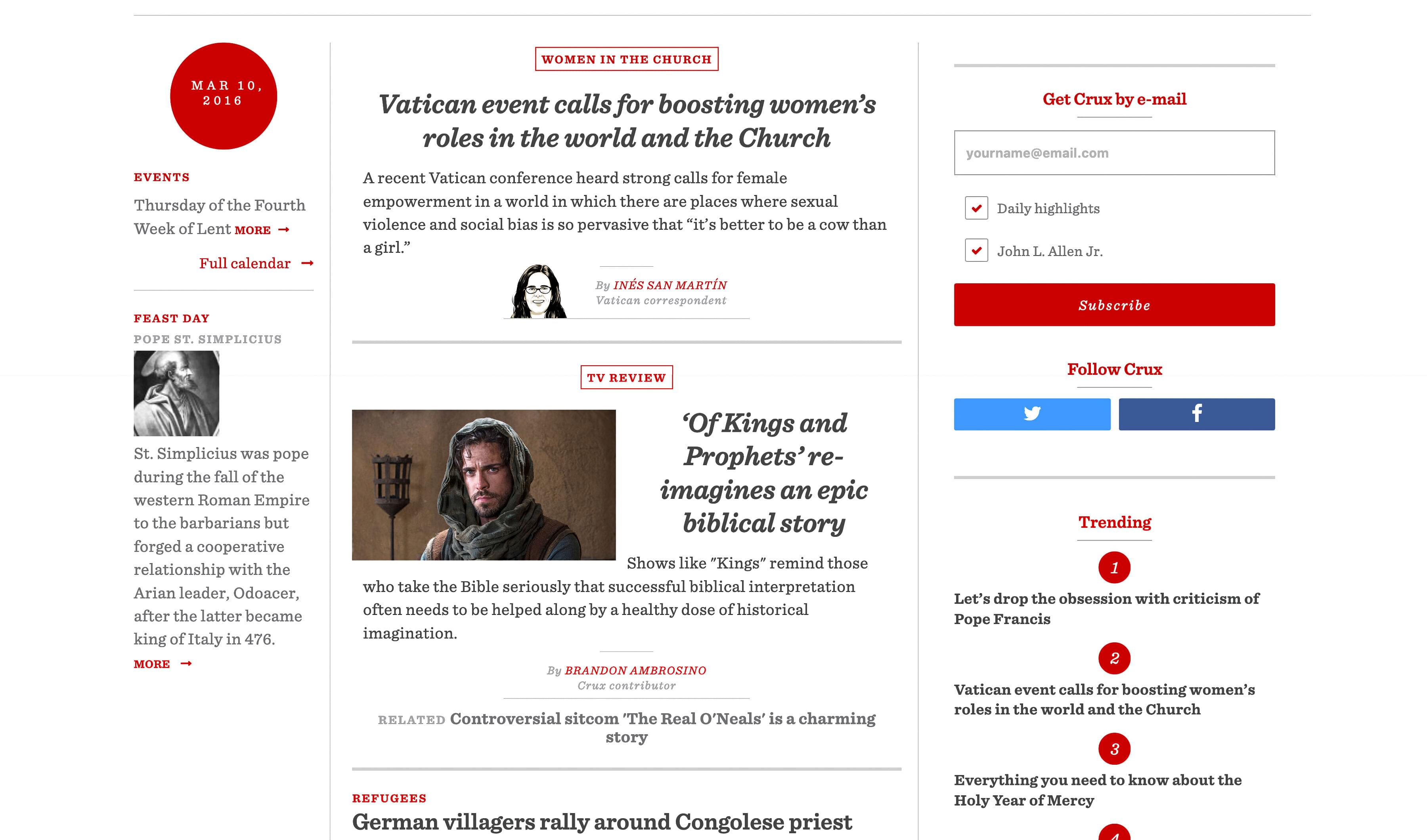
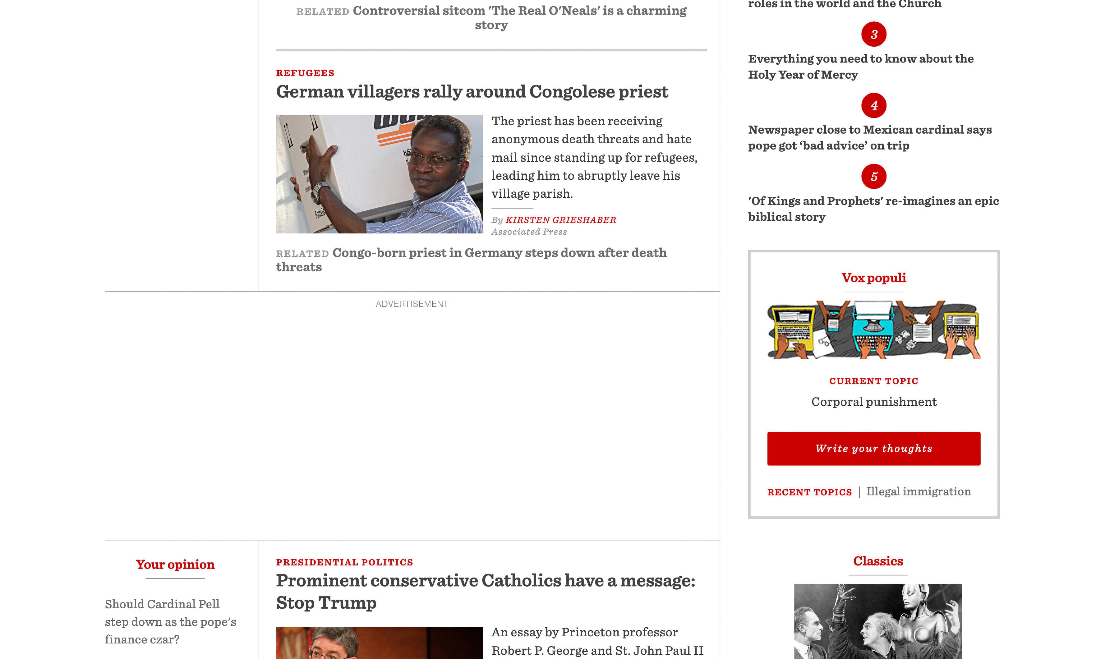
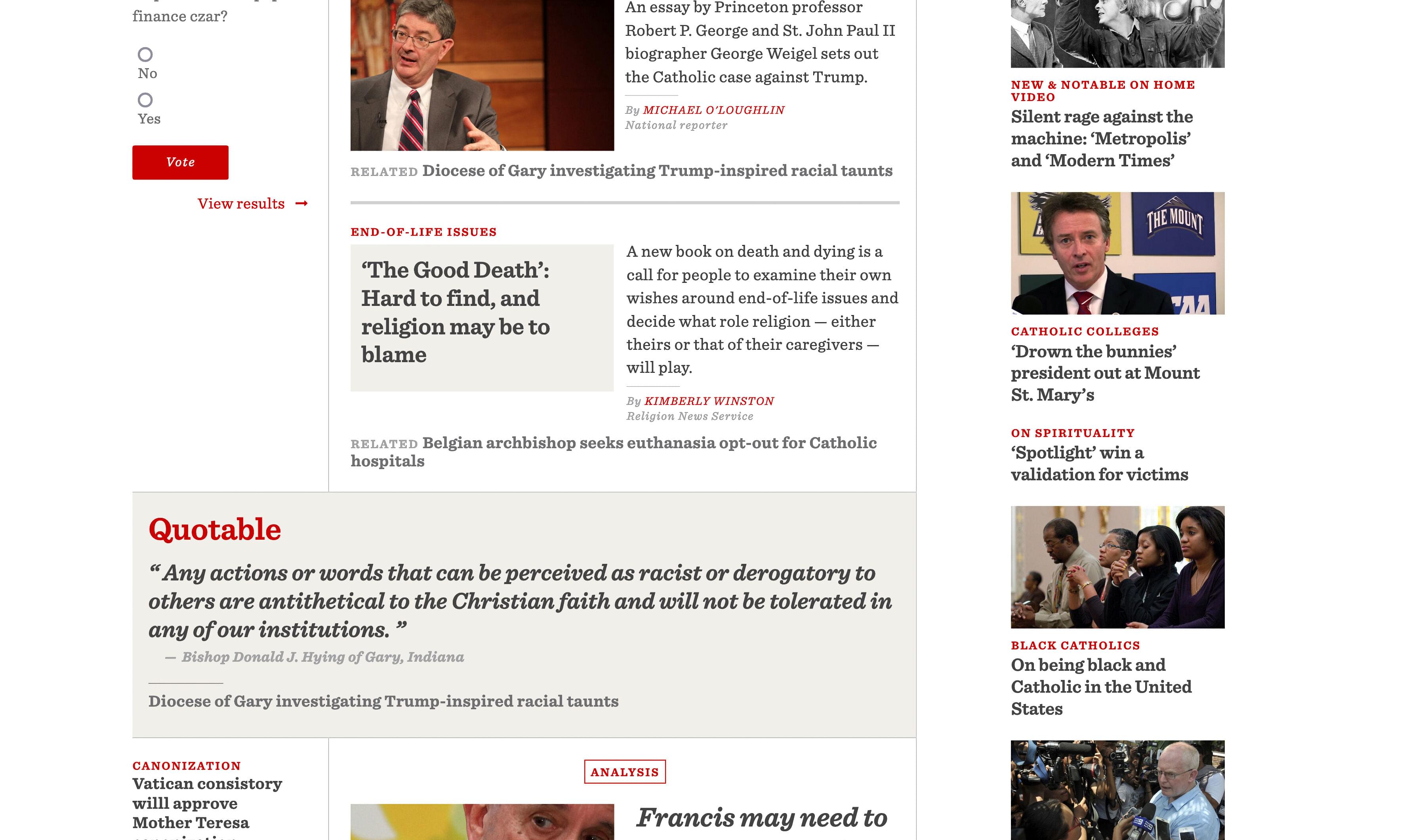
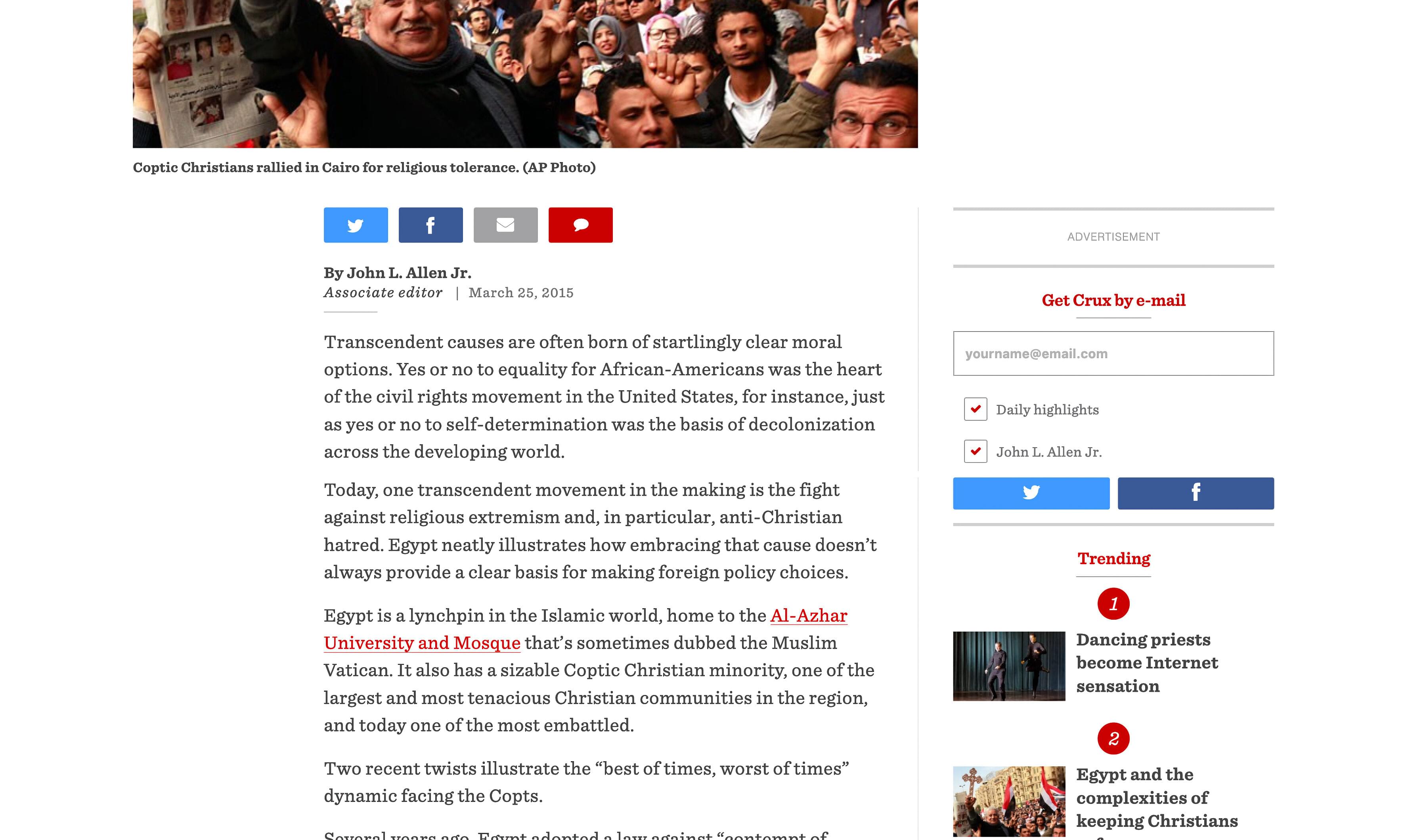
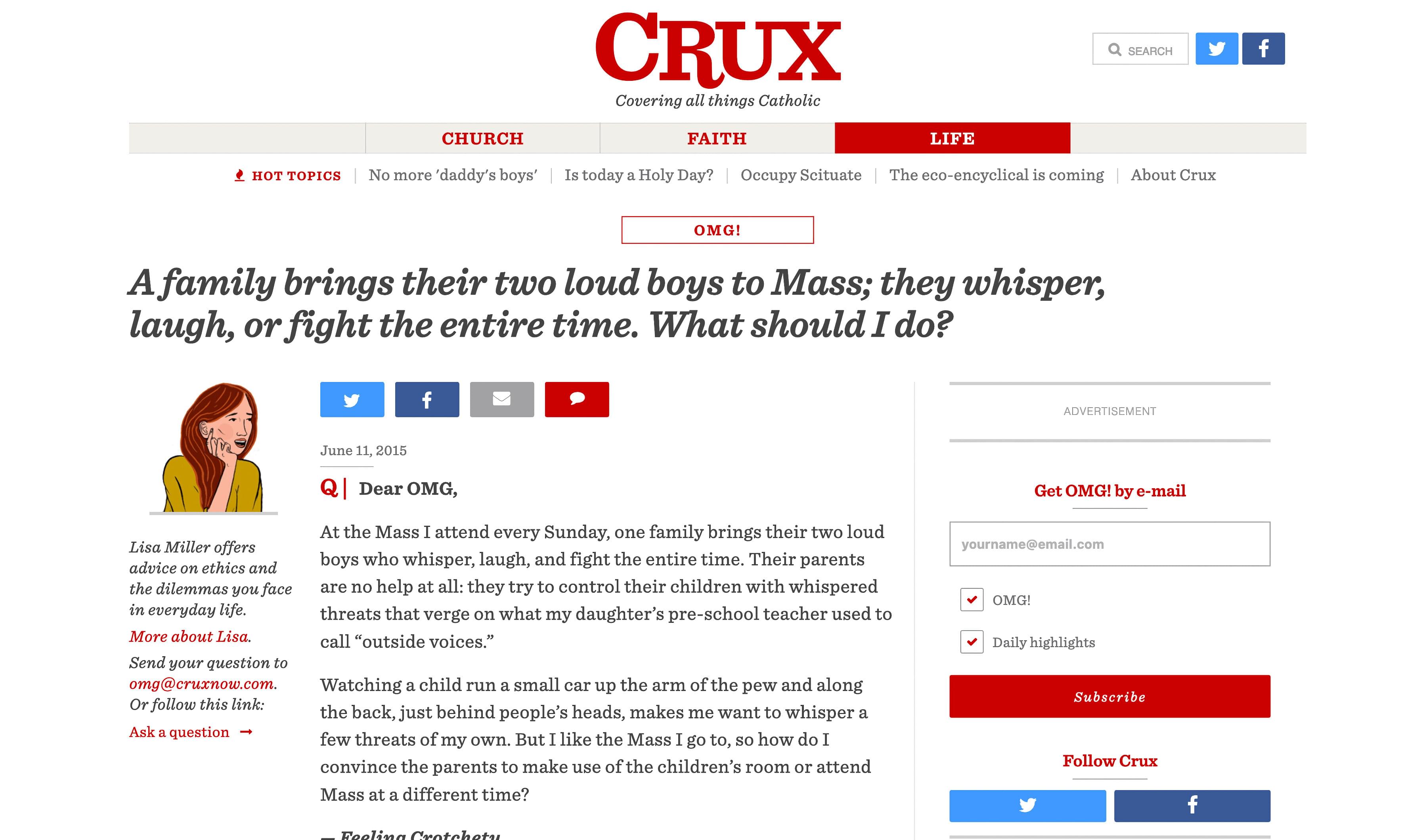
No. 2 | Crux needed variety in its presentation
News sites – at least at that time – tended to package all their news in the same type of container, whether it fit or not. Crux wanted to have unique displays for different types of stories
- A standard news template
- A news template highlighting stories written by Crux staff
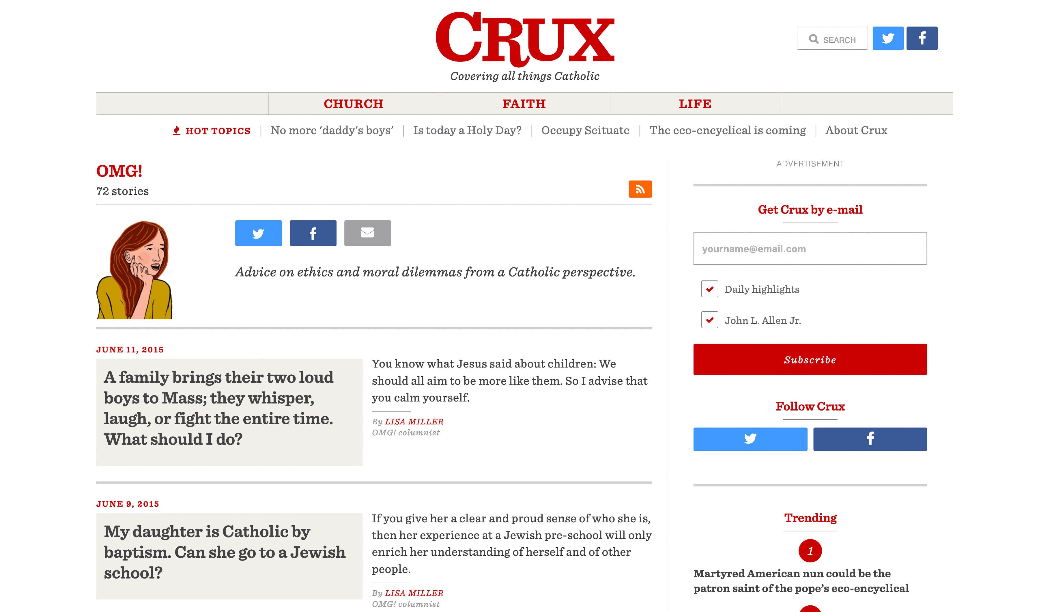
- A softer feature template for reviews, human interest and the like
- A columnist or opinion template
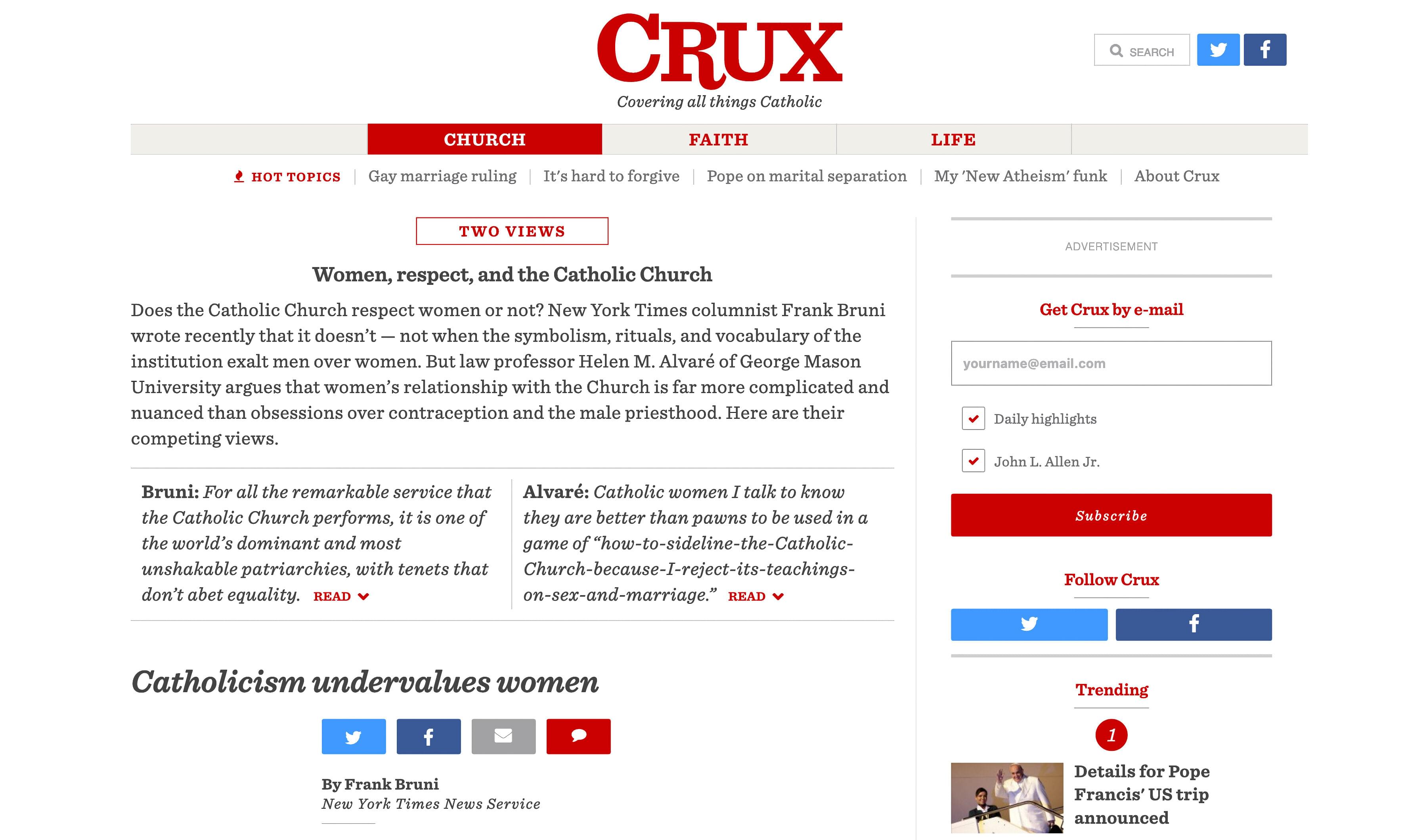
- A point / counterpoint template
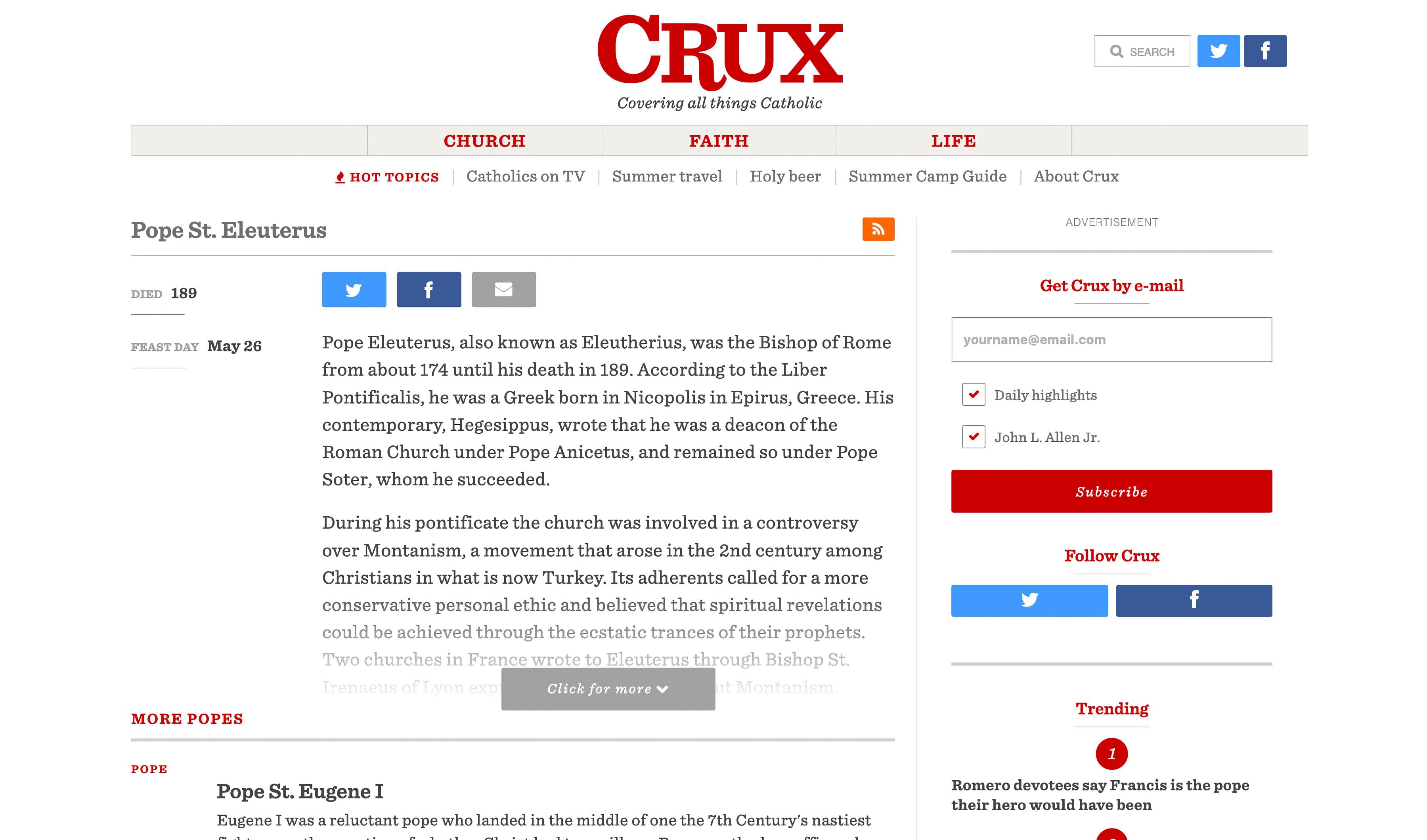
- Saints and popes database Additionally, these story pages were reflected on homepage presentation styles for the individual story tiles.
No. 3 | Do it fast – so design in browser
Crux was a rush job. It went from inception to launch in just a few months, so Crux was built in browser. This was an enormous challenge for me as developer and designer, in terms of workload. Design reviews and dev reviews were the same thing, essentially.
Among the strengths of this approach:
- Speed of napkin sketch to design to code
- Very little time gap between ending design and shipping site
Among the weaknesses
- Small design changes – eg “can that be moved to the left side” – can require big code changes
- Inflexibility of code-first means less experimentation and iteration
No. 4 | Crux had an awesome 404 screen
OK, not a challenge. But I love a good hidden bit, and Crux had a good one – and a sense of humor. The Cruxnow.com 404 screen was an image of St. Anthony, patron saint of lost items. It linked to his page in the Saints and Popes database. Additionally, because a 404 page should not leave users lost, it also directed them back to the main site.
Cruxnow.com on the Internet Archive